Pay Gaps
2018
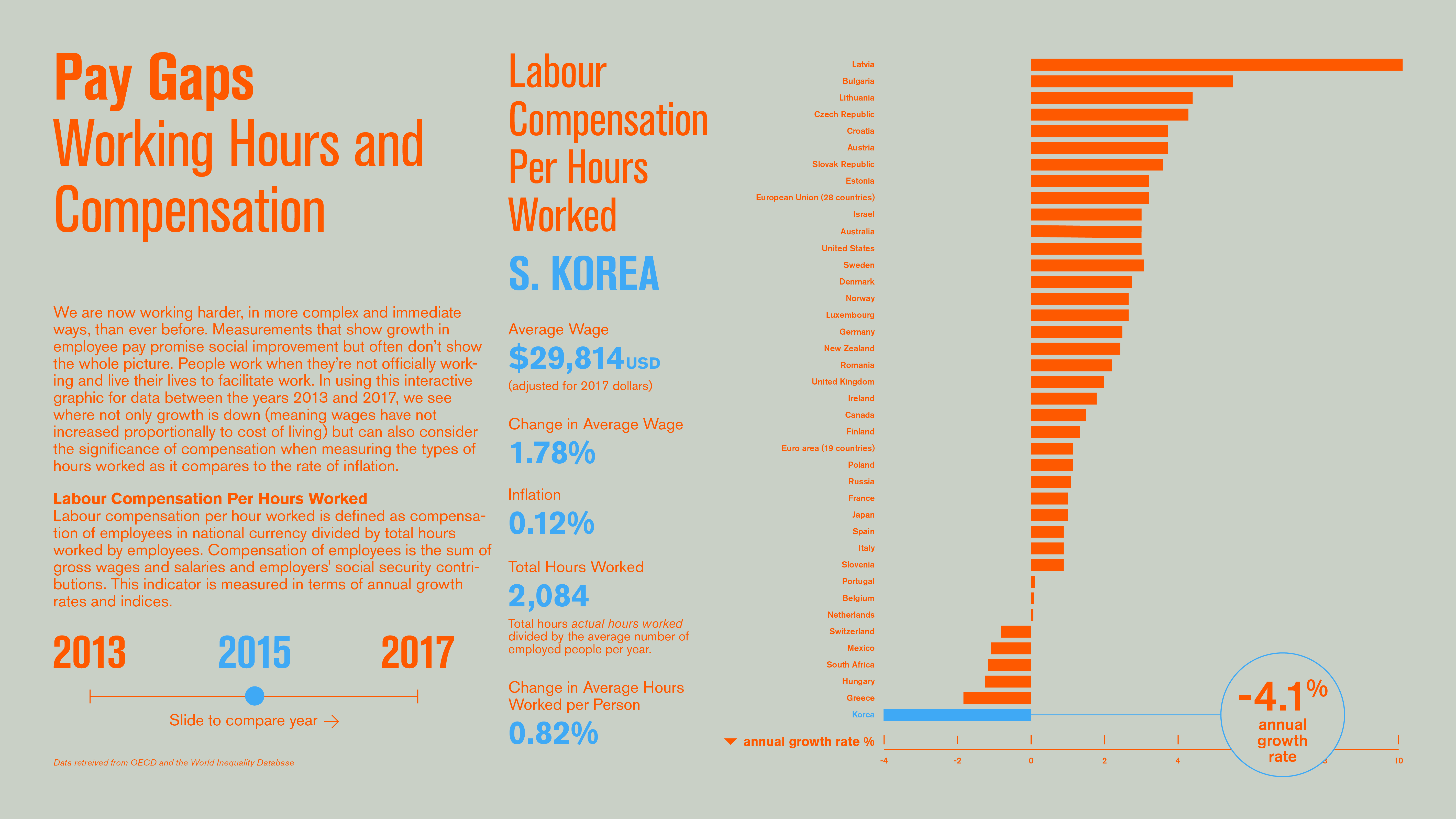
Interactive graphic for data from the Organization for Economic Co-operation and Development (OECD) between the years 2013 and 2017 that contrasts average wage increases with average hours worked among a group of developed international countries.
Developed for an information design studio course that explored the interpretive possibilities of publically available data.
Developed for an information design studio course that explored the interpretive possibilities of publically available data.
Project type:
information design
information design